Jeremy Saunders is a UK born, Sydney based key art designer, responsible for some of the most memorable movie posters in recent memory.
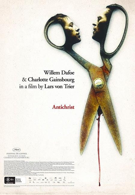
His latest, the devastatingly provocative key art design for Lars von Trier’s controversial Antichrist, set the web afire upon its release.
The following is an interview with Jeremy, who kindly took time out from his busy schedule to talk about that Antichrist poster, his work and influences.
Enjoy!
Your key art for Antichrist has hit a nerve. What type of reactions - positive or negative - have you received since its release?
An incredible wave of generally positive stuff really. I was away on holiday when someone sort-of nicked it from my Facebook page and it spread like wildfire through the web. I turned on my (laptop) a few days later from a hotel in Palm Springs, and was inundated with emails and posts and pings and requests for interviews and information and you name it. My website got overloaded and crashed, I was getting job offers via twitter and I got subjected to a series of DDOS attacks from some Christian hackers. It was all a bit weird. My favourite reaction was on a blog somewhere where the commenter apologised to everyone “on behalf of Australia” for this "offensive poster". It's quite something, to have someone apologise for your work on behalf of the nation. I recommend engineering something similar if you have even the slightest inclination, Matthew.
The scissors, of course, tap into a controversial moment in the film. What moved you to use the scissors as the focal point in your key art?
Well we didn't really want to go down the 'story' route, and I will do practically anything to avoid the 'actor' poster, so it was simply a question of stepping back and taking the one thing that everyone has heard about Antichrist, and making that into the sell. Andrew Mackie (from Transmission) called me the day before I was going on holiday and said "I know you've got no time, so go crazy. I just want something Polish," and that was pretty much the extent of the discussion. I think I said something like "I think I'll just put a pair of rusty scissors on there," and he laughed. The decision-making process took about 40 seconds to be honest. It just felt like the right thing to do. I think the ensuing brouhaha bears that out. I'm not even sure if there's any need to actually print the thing now really.
I did get really excited about the idea while I was doing it. I have the attention span of a Ritalin-deprived gnat so going from starting the DVD to finishing the poster 3 hours later was perfect for me. I felt really excited when it was done, I had to go for a long walk to calm down.
It's not a particularly deep interpretation (although I think the addition of the faces really helps it work on more than the obvious level) but especially with a controversial, 'hot button' film like this, you're raising awareness and pushing that button as loudly and hard as possible because the campaign needs to reflect the film, for one, and to stand out in the midst of bigger, more complex campaigns for, you know, whatever else is out this week. So it's sort of a petulant, flashy, attention-grabbing technique to tease something a bit more interesting, which is kind of fitting for a Lars von Trier film, I can't help but feel.
Does a viewing of the film prior to hitting the drawing board an important part to the creative process?
Absolutely, although in this case given I had about 3 hours from getting the job to sending the poster for approval there was a bit of leaning on the fast forward button in all honesty. But yeah, you can maybe reflect the visual style by looking at the stills, but it's about much more than that. You need to understand the tone, the pace, the mood. There's so much more to a film than the purely visual, or the plot. Or at least there should be. And there's no way of getting what that is without watching the film. The design part of my job is the tiniest part, really, any monkey could do it. The important bit, the fun bit, is analysing the film and interpreting it. That's where everything interesting happens.
What do you believe are the key factors in creating a successful key art campaign?
I'm not sure it's anything more than understanding the film and the audience. Of course there are a million ways to interpret any film and sell it to any segment of the potential audience and that's where the problems crop up. But to give you the best chance of getting it right, you need an incisive understanding of what the hell the film's about (and many filmmakers kind of fluff this bit, worryingly) and who is going to enjoy it, and be quite bloody-minded about making sure they know about it. Really, really good on-set photography is crucial for the whole campaign and everyone skimps on it, it's really depressing. And remembering that no-one knows anything, including me.
How did you become involved in your profession?
I just sort of fell into it by hanging out with a bad crowd (i.e. filmmakers). I was doing a gig as a web designer and a friend asked if I could do a poster for their short film. That went well, and someone else asked me to do one for them, and so on and so on. I can't really offer a definitive career path really, but allowing for the occasional disastrous manoeuvre it's generally gone okay up to this point.
Who are you influences and inspirations? (Can be in your field, or not).
The big guns of poster design like Saul Bass and Robert McGinnis are big favourites but pretty much anything can influence or inspire one way or the other. I love the eastern bloc posters of the 60's and 70's, the imagination and flair is beyond anything else really. There's a Norwegian key art designer called Egil Haraldsen who rocks.
What gets your creative juices flowing?
Any film suffused with ideas. Sadly few and far between.
Having viewed the highs and lows of the local film industry from a close perspective, how do you think the industry can overcome the funk it is in?
Ah, it seems to be doing okay at the moment all things considered. We need a good mix of films and this last year it's been better than I can remember it being. We need to stop rewarding mediocrity and reward individual vision and passion. Not all of them will be successful but if the state is sponsoring art then a creative criteria needs to be involved rather than a strictly commercial one. Of course the sort of films I like are the ones no-one else wants to see, so maybe I'm not really the person to ask. Actually I'm really not the person to ask.
View Jeremy's work at Jeremy Saunders.com .
Antichrist will be released on the 26th of November through Paramount Pictures/ Transmission. |